A good business card still works because it puts your name in someone's hand at the exact moment they want to remember you, and smart business card printing makes sure that moment sticks. The card that gets used is the one that's easy to read, feels good to hold, and gives the person a clear next step. Design and paper do most of that job; the rest is printing choices most people ignore until a card feels cheap.
Key takeaways
- A business card earns its place because it hands over your contact info in person, when interest is highest and a typed-in number is easy to lose.
- The most-used cards keep the front simple: name, title, one phone number, and a clear way to reach you, with plenty of open space.
- Paper weight and finish shape how a card feels; 16pt stock with a soft-touch or matte finish reads as more established than thin, glossy cards.
- A QR code or short link turns a paper card into a bridge to your website, booking page, or portfolio, and lets you measure whether cards get scanned.
- Order in reasonable batches and proof the physical card before a full run, since a typo on 1,000 cards is an expensive fix.
Why the business card still earns its place
The business card survives because it does one job digital tools handle poorly: it hands your contact info to a real person in the moment they want it. You meet someone at a chamber event on Gay Street, they ask what you do, and you give them something tangible instead of asking them to type your number into a crowded phone. That physical handoff carries a small signal of professionalism that "text me your info" never does.
We work with plenty of Knoxville businesses that live online, and even they keep cards on hand. Contractors leave them at job sites; restaurant owners tuck them into to-go bags. A card sits in a wallet or on a desk long after a conversation ends, which is why print still pulls its weight alongside your digital presence.
The card that gets used is not automatic, though. A cluttered, flimsy card gets tossed; a clear, well-made one gets kept and passed along. The difference is design and printing, not luck.
Design choices that make a card memorable
Good card design starts by cutting, not adding, so the front reads at arm's length in about a second.
Keep the front simple
Put the essentials up front and give them room to breathe:
- Your name and title
- Business name or logo
- One phone number (the one you actually answer)
- One email or website
- A QR code or short link, if it fits cleanly
That's usually enough. Cram three phone numbers, two emails, an address, and a tagline onto a 3.5-by-2-inch card, and everything shrinks so nothing stands out. Use the back for the extras: a service list, a map, a QR code, or a simple offer.
Make it match the rest of your brand
Your card is a small piece of a bigger system. The colors, fonts, and logo should match your website, your signage, and your social profiles so the whole thing feels like one company. A card that looks nothing like the website someone visits afterward plants a seed of doubt. This is why we push clients toward consistent brand identity work instead of one-off pieces, and it's what our creative and brand design team does daily.
Leave white space and pick readable type
Set your name in a size someone can read without squinting, keep body text at 8 point or larger, and leave a clear margin around the edges. Text that runs too close to the edge often gets clipped during cutting. Open space is not wasted; it makes the important lines easy to find.
Paper and finish: what signals quality
How a card feels in the hand tells people something about your business before they read a word, and the paper stock does most of that talking.
Weight and thickness
Card stock is measured in points (pt), which describes thickness. Here's a rough guide:
- 14pt: standard, sturdy, fine for most businesses
- 16pt: noticeably more substantial, a common upgrade
- 32pt and up: thick, premium cards, often with a colored edge
Most of our clients land on 16pt: solid without a big jump in cost. A thin card bends and curls in a wallet, and people read that as corner-cutting.
Finish and coating
The coating changes both the look and the feel:
- Matte or soft-touch: low glare, easy to read, a smooth premium feel
- Gloss: bright colors and photos pop, but glare can make text harder to read
- Spot UV: a shiny coating on select areas (like a logo) over a matte base, for contrast you can feel
- Uncoated: writable with a pen, natural texture, good for a handcrafted brand
There's no single right answer. A photographer might want gloss so images look rich; a law firm or builder might prefer soft-touch for a quieter, established feel. If people will jot notes on the card, uncoated is the practical pick.
Special touches, used sparingly
Foil stamping, embossing, rounded corners, and painted edges all raise the perceived value of a card. They also raise the price, so use them where they earn attention rather than everywhere at once. One well-placed foil logo beats a card buried in effects.
Bridging the card to digital
A business card and your website should work as a team, and small additions turn a static card into a doorway to what else you offer.
QR codes done right
A QR code lets someone scan the card with a phone camera and land wherever you send them. A few rules keep it useful:
- Point it somewhere specific, like a booking page, a portfolio, or a Google review link, rather than your homepage.
- Give it quiet space around it so the camera reads it cleanly, and print it at least 0.8 inches square.
- Test the printed code with more than one phone before you approve the full run.
- Use a trackable short link behind it so you can see how many people scan.
That last point matters. A QR code routed through a link you control shows whether cards actually drive visits, the same measurement mindset we bring to reporting on marketing results.
Send people to a page that's ready for them
A scan is wasted if it lands on a slow or confusing page. Make sure your site loads fast on a phone and gives an obvious next step, like a call button or a short form. If scans land and nothing happens, our post on why websites don't generate leads is a good place to start.
Ordering and proofing without regret
This last stretch is where good cards get ruined, so slow down before you print.
- Proof the real thing. Approve a digital proof, then a physical sample on large runs, since color shifts between a screen and paper.
- Check the small stuff. One wrong digit in a phone number ruins a whole box.
- Order sensibly. A batch of 250 to 500 is plenty for many small businesses; you can reorder, and you may want to update the card sooner than you think.
- Ask about bleed. Give the printer art that runs past the trim line so no white slivers show after cutting.
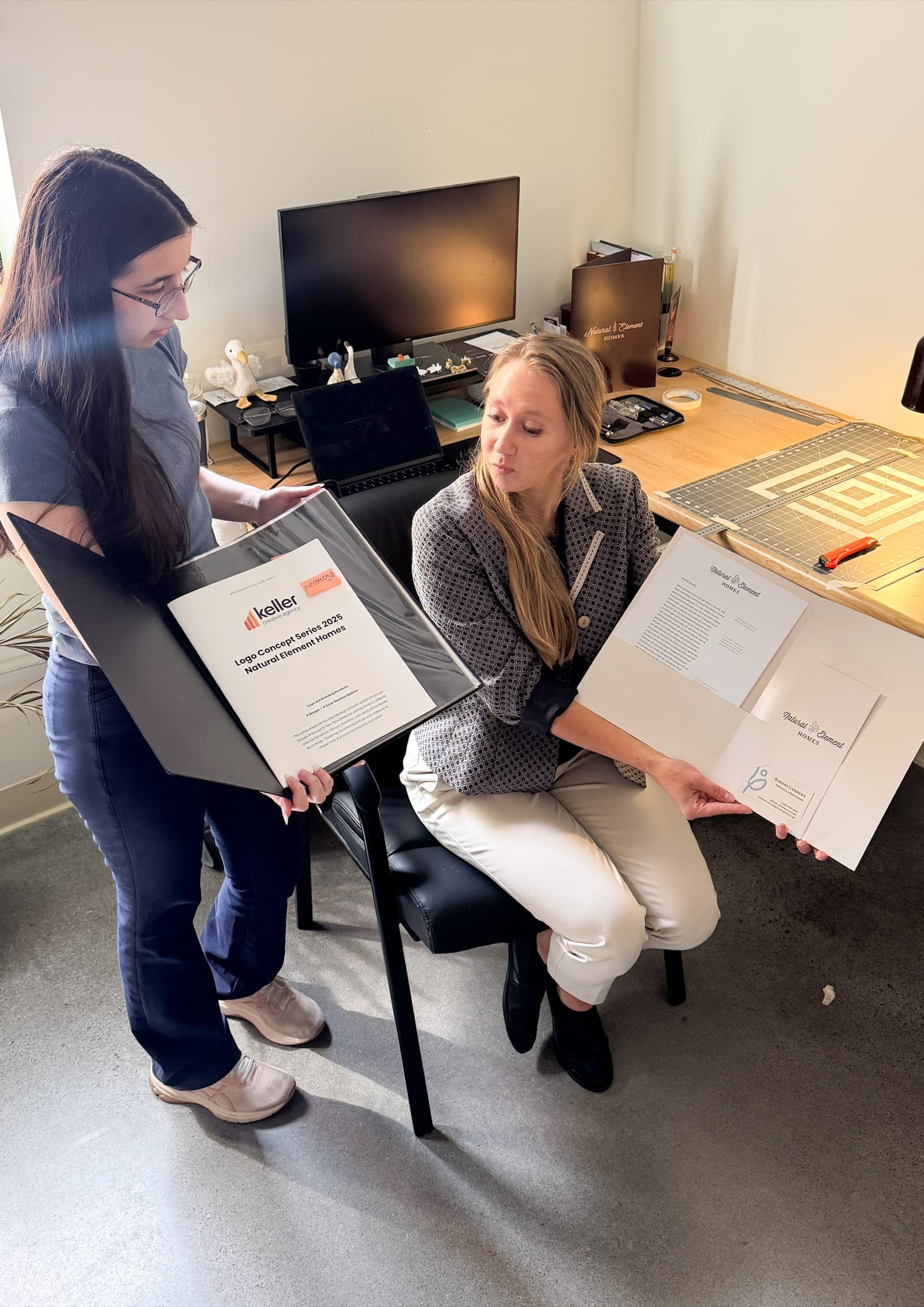
We handle business card and commercial printing for East Tennessee businesses, which means one team sets up the file, checks the color, and stands behind the finished stack. For more ways print fits a local plan, see our print marketing ideas that still work.
Ready to make cards people keep?
If your current card is thin, crowded, or years out of date, we can help you design and print something that reflects the business you run today. To get started, book a free strategy session with Keller Creative and we'll look at your card, your brand, and how print and digital fit together.
About the author
The strategists, designers, and producers at Keller Creative, a full-service marketing, advertising, and production agency in Knoxville, Tennessee. We help East Tennessee businesses grow with work we can measure.
Related Services